

It’s a common marketing misconception that you need more visitors or a bigger audience to sell more products. A lot of times, the answer lies in maximizing the audience you already have. [Insert that old cliché about it being cheaper to keep an existing customer than win a new one…]
But have you checked your conversion rate lately? It’s your number of monthly sales divided by your number of unique monthly visitors. The result is expressed as a percentage—that’s your conversion rate.
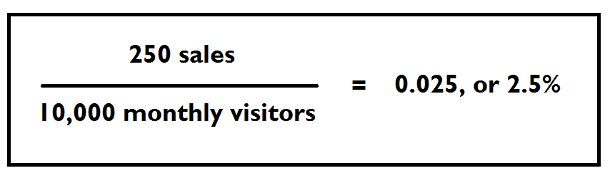
Conversion rates vary widely by industry and the product you’re selling. Generally, though, a conversion rate between 2% and 3% is a great benchmark to shoot for. If you’re not hitting that mark, it’s time to take a close look at your checkout process to see where there’s friction—little speedbumps that are slowing your customer down or preventing them from completing their purchase.
Even if you are hitting a 2-3% conversion rate (or exceeding it—go you!), there’s still plenty of room to grow. Imagine being able to double or even triple your sales each month, just by optimizing your checkout?
Here, we’ll go over some of the most common friction points that are keeping your customers from cashing out and show you how to fix them.
Friction
First, let’s talk about friction.
In a nutshell, it’s anything that happens during the sales process that the buyer has to overcome in order to become a customer. Let’s say you’re on your way to Chik-Fil-A to pick up some of those addictive waffle fries. When you get there, the drive-thru line is around the block. Friction! The wait is too long, so you drive across the street and settle for Mickey D’s instead.
Friction—though probably of the non-fast-food variety—affects your prospective customers the same way. The greater the friction, the lower your conversion rate.
There are two types of friction: external friction, like the customer’s budget constraints, and internal friction, like the checkout process on your website. In this post, we’re addressing internal friction because those things are in your control.
The buyer already has to come a long way to become your customer. They have to justify the purchase, find the money in their budget, use their lunch break to log onto your website and shop, etc. These are things you can’t control.
So, you should be doing everything in your power to eliminate the friction you can control. That means optimizing everything that happens on your website during the point of sale.
It makes no sense to attract more visitors if you’re not converting the ones you’re already getting. It’s a waste of resource. First, fix your on-site conversion by addressing the friction points below.
Navigation
First things first: can the visitor find your checkout?
Your website needs to be easily navigable, with clear, easy-to-find links that address a visitor’s most common needs.
A good rule of thumb I like to go by when designing a website’s navigation is to give each page a single objective. This means you shouldn’t house your ‘About Us’, your pricing and your shopping cart all on the same page. That would be a nightmare on the eyes and the brain! Rather, each should have its own clearly labeled page of the site.
If a page is trying to do too much, it’s easy for the reader to get confused and leave. Here are a few likely pages you’ll want to have on your site, each with a clear button in your main navigation menu:
- Home
- About Us
- Products/Services (if you have many, this might be a dropdown sub-menu or an entire designated e-commerce section)
- Pricing (for service providers)
- Shopping Cart/Checkout
- Contact Us
For a quick gauge of whether your site is easy to navigate, take a look at the bounce rate for your home page (this can be found using a free tool like Google Analytics). Your bounce rate measures the number of visitors who leave without ever making it to a second page of your website. Like golf, a lower number is better.
If your bounce rate is above 70-75%, it’s a good indication that visitors aren’t finding what they’re looking for when they arrive on your home page, and you’ll probably want to do some tweaking.
Load Time
It’s the most senseless reason for losing sales: your site takes too long to load. This means you’re losing a potential customer before they even make it inside your digital door!
What’s more, Google’s algorithm reportedly uses load time as a ranking factor for websites, with slow sites being displayed lower in the search results.
When it comes to load time, every millisecond counts.
Related: 5 Easy SEO Fixes to Improve Your Google Rankings
In one example, the shopping platform Mobify reported that for every 100 milliseconds (that’s a tenth of a second) their customers were able to shave off the load time of their checkout pages, they saw a 1.55% increase in session-based conversions. That’s the equivalent of an annual average revenue increase of $526,147. That’s half-a-million dollars more per year for a fraction of a second’s difference!
This is hardly an exceptional case; UK-based SEO firm Hobo gives several more truly amazing examples of how load time can dramatically impact revenue in this report.
Here are a few ways in improve your page load speeds:
- Enable browser caching. This means once someone has already been to your website, it loads faster the second time around.
- “Minify” your code. This removes unnecessary strings from your website’s JavaScript, HTML or CSS code without changing how the site operates. You can minify your code with a plugin like Super Minify for WordPress.
- Optimize your images. The images you upload to your site should be only as large as they need to be to display without getting pixelated, and no larger.
- Upgrade your site’s hosting. Most hosting providers will start you out on the lowest plan you need (i.e. designed to handle up to 10,000 visits per day). Once you’ve grown past that point, your server response times can suffer. Speak with your hosting provider to see if it’s time to upgrade.
Mobile Optimization
The average American now spends far more time on his or her smartphone than on a desktop computer. In fact, one in ten smartphone users has entirely opted out of having a broadband connection at home in favor of using only their phone.
That’s why it’s so, so important to design your checkout process with a mobile-first perspective. I feel like I’m stating the obvious, but so many retailers don’t do this. Their checkout process works fine on desktop, but is a confusing mess on mobile. Even some major big box stores have this issue! For mobile customers, the simpler the checkout process, the better.
Ensure that form fields are easy to fill out on a small mobile screen. Whenever possible, make the form field responsive to the type of information you’re asking for. So, if you’re collecting a customer’s phone number, your mobile form field should automatically display the telephone keypad for entry, rather than the text keypad.

For dates, offer a pop-up calendar. Here’s a great list of many different mobile entry types you can and should take advantage of.
Length of the Checkout Process
Again, our goal is to remove as much friction as possible from the user’s checkout process. One good way to do this is to remove as many physical steps in the process as possible.
As you’ve probably noticed, some e-commerce platforms default to collecting the billing address, shipping address and payment info all on separate pages. Why make your user click through so many different screens? Instead, consolidate all the necessary checkout fields onto a single page. Enable a check box that can duplicate the billing and shipping address if they’re the same.
You can further eliminate friction by reconsidering the amount of information you’re collecting. For example, do you really need a customer’s phone number, or will their email address suffice?
Try to look at your checkout process as an editor would look at a manuscript, cutting out anything unnecessary. Better yet, sit down with a few actual customers and have them share their thoughts out load as they go through your checkout.
Finally, if you sell something that’s a recurring purchase, like a cosmetic that a customer will need to buy again each time she runs out, consider enabling an auto-refill option. This not only saves the customer the hassle of coming back to your website month after month (which they might not remember to do), but it gives you an easy, recurring revenue stream.
Most e-commerce platforms have a plugin for enabling auto-refills, like Recurring Orders & Subscriptions for Shopify stores.
Questions Answered
Don’t make the customer get in touch with you to have their questions answered. In many cases, they won’t bother, or they’ll go somewhere else to find the information!
Instead, eliminate this friction point by answering as many questions as you can directly on your website.
This is one area where the billion-dollar-companies edge out small businesses. Their sites are chock full of answered questions. Home Depot is an amazing example.
I recently had to buy some window blinds, something I’m completely unfamiliar with. I had a lot of questions. How do I measure my windows correctly? Is the hardware to hang the blinds included? Every single one of them was answered on Home Depot’s product page.

They also offered this collection of helpful videos describing ‘What You’ll Need to Know,’ like how to hang the blinds and what to do if they’re too long. It’s like they read my mind! Buying from them was a no brainer.

This is now my gold standard for an e-commerce product information section.
Use FAQs, blog posts and videos whenever possible to answer the questions your shopper has—before they ask.
Easy Pricing
Last but not least, your pricing.
If you sell a product, this should be straightforward. The price will go directly on the product’s page. No friction there.
If you sell a service, it’s not always that simple. Service pricing may vary depending on exactly what the customer wants, the time is will take to complete, and other variables.
Still, this isn’t an excuse to leave pricing off your website. Any extra steps a customer has to take to find out how much it’s going to cost them add a whooooole lot of friction to the sales process. Today’s buyer doesn’t want to talk to a salesperson. They want to know right now whether you’re in their price range.
Instead of making a customer call for pricing or request a quote, use this tried-and-true tactic: place your pricing chart behind an email opt-in form.
This does three important things:
- Allows the customer to immediately get a sense of what kind of investment they’re looking at
- Captures their email address so you can follow-up with future marketing emails
- Weeds out bargain shoppers who won’t pay your rates
There’s as much to be gained on your side as the customer’s side by offering pricing directly on your site.
To hammer it home, here’s an example from Hubspot, who added a downloadable pricing guide to one client’s site.

Pretty impressive results.
Test, Then Test Some More
Even if you’re happy with your site’s current conversion rate, don’t get complacent. A half-a-percent increase in your conversion rate can translate into hundreds of thousands of dollars more a year in annual sales, and you’ll only get there if you keep testing different variables.
Are you making customers create an account before they checkout? Try adding a guest checkout option.
Does clicking the ‘Buy Now’ button lead to a new checkout page? Try an pop-up checkout window and see how it performs.
Small changes to your conversion rate, like a 0.5% improvement, can make a big difference when it comes to dollars earned each month.

Tami Brehse
Latest posts by Tami Brehse (see all)
- This White-Hat Link Building Tool Will Supercharge Your SEO Strategy - May 20, 2019
- 6 Steps To Take Before Launching A New Business - February 1, 2019
- How To Build A Website For A New Business: The Basics - January 13, 2019

